
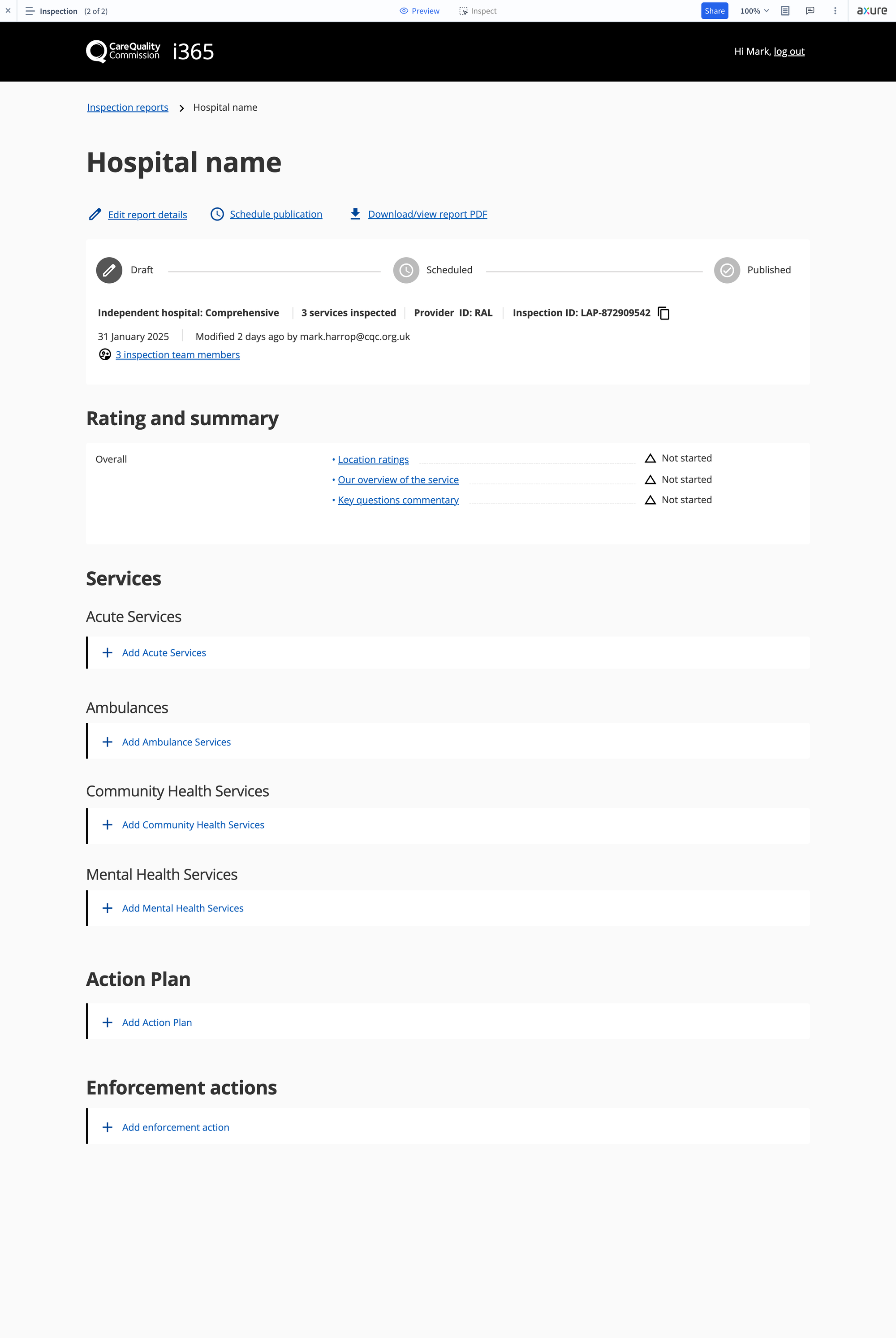
This week, we made significant strides in refining our prototypes and designs. The big challenge came with the new LAP + ASG report template. Unlike existing Dynamics 365 reports, this one introduces a deeper structure with an extra layer of hierarchy. While we anticipated some friction, we quickly realized the existing UX—designed over four years ago—wasn't equipped to handle this added complexity. Navigating through so many layers could severely impact usability, so we focused on reworking the information architecture (IA).
We kicked things off with wireframes and user testing to find a solution that maintained the core functionality inspectors rely on in I365, while making navigation more intuitive. A key insight came from our work with legacy Trust reports, which often left users feeling "lost" due to their sprawling multi-section layouts. The existing interface struggled to keep users oriented, so we knew we had to improve this experience.
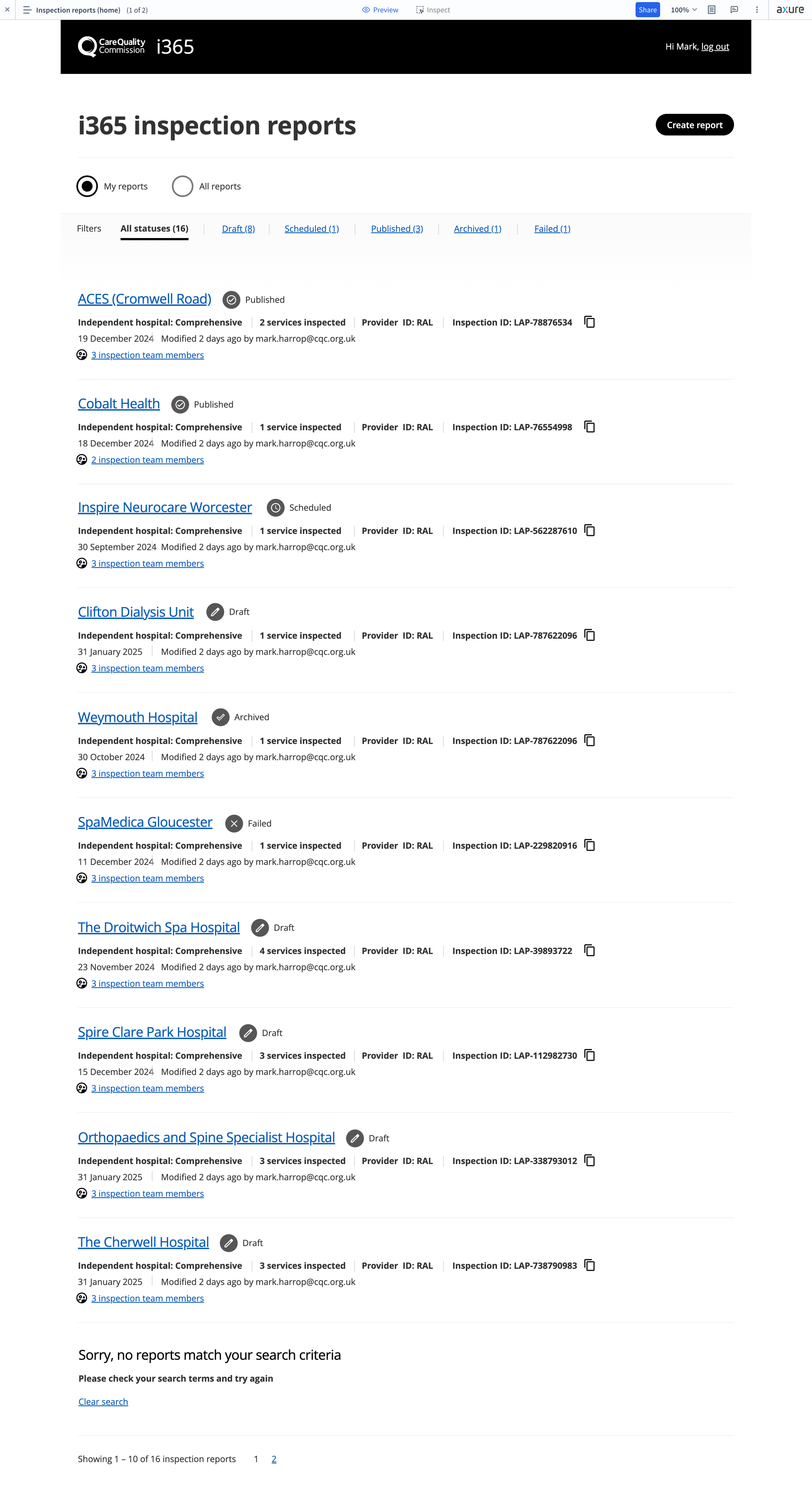
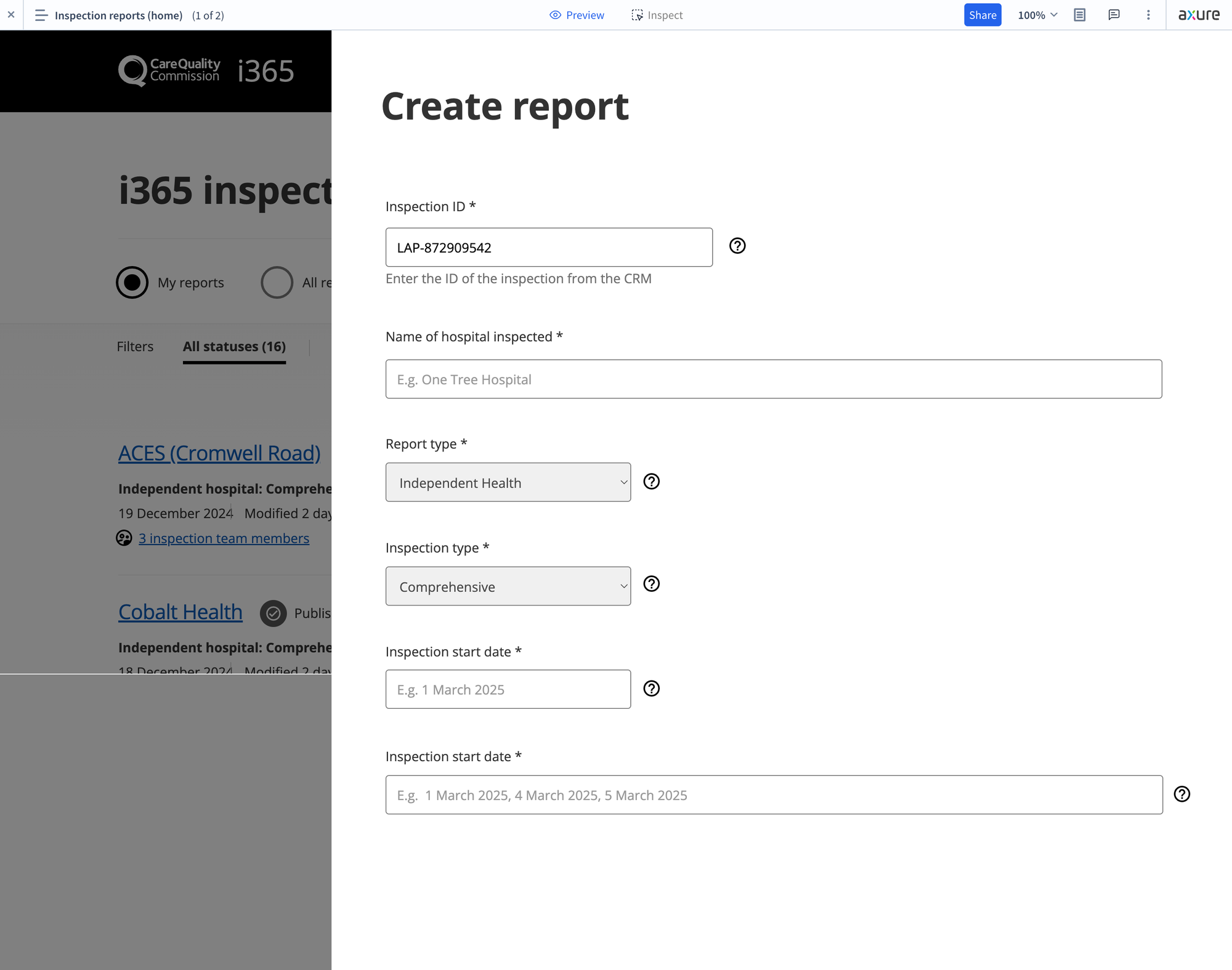
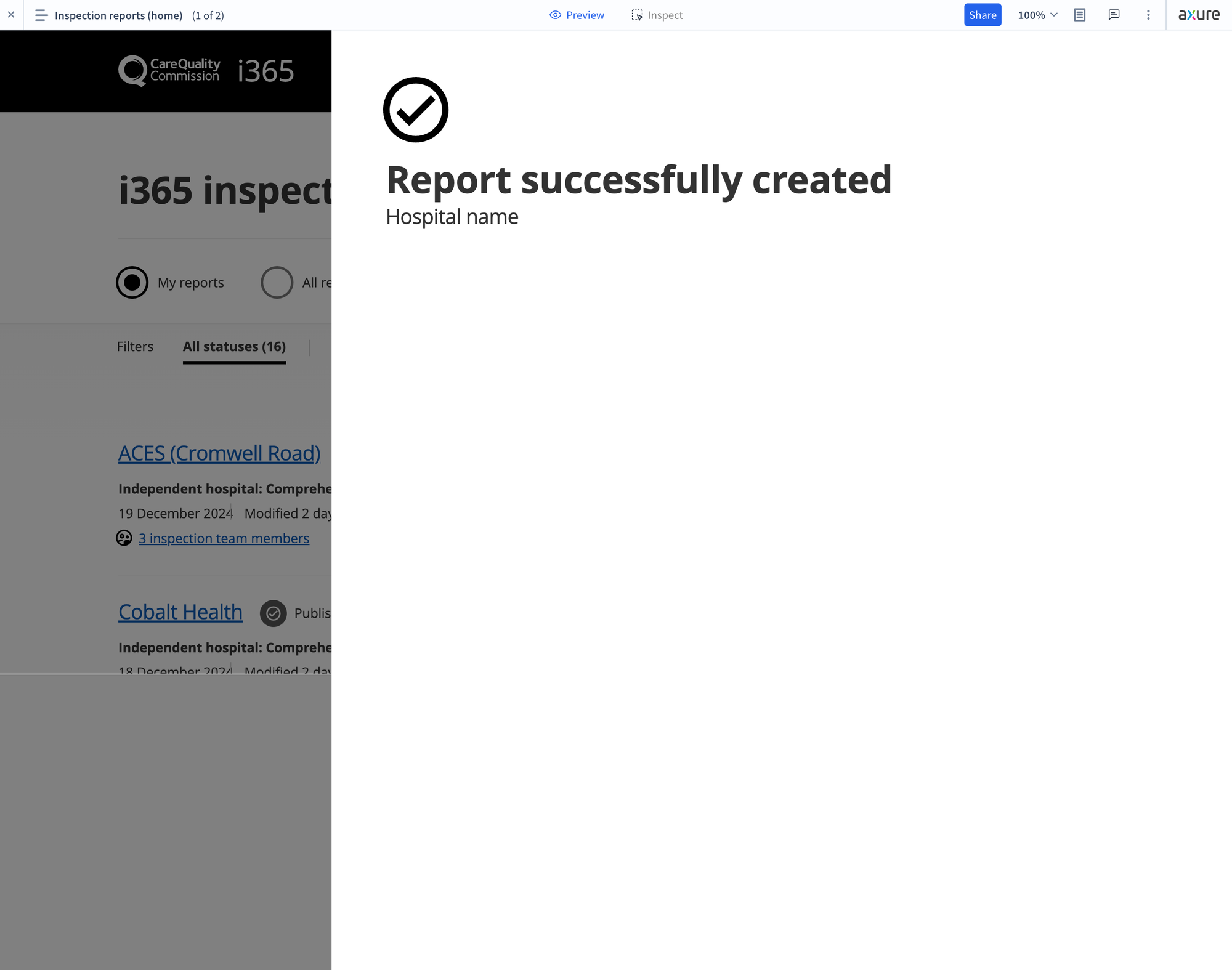
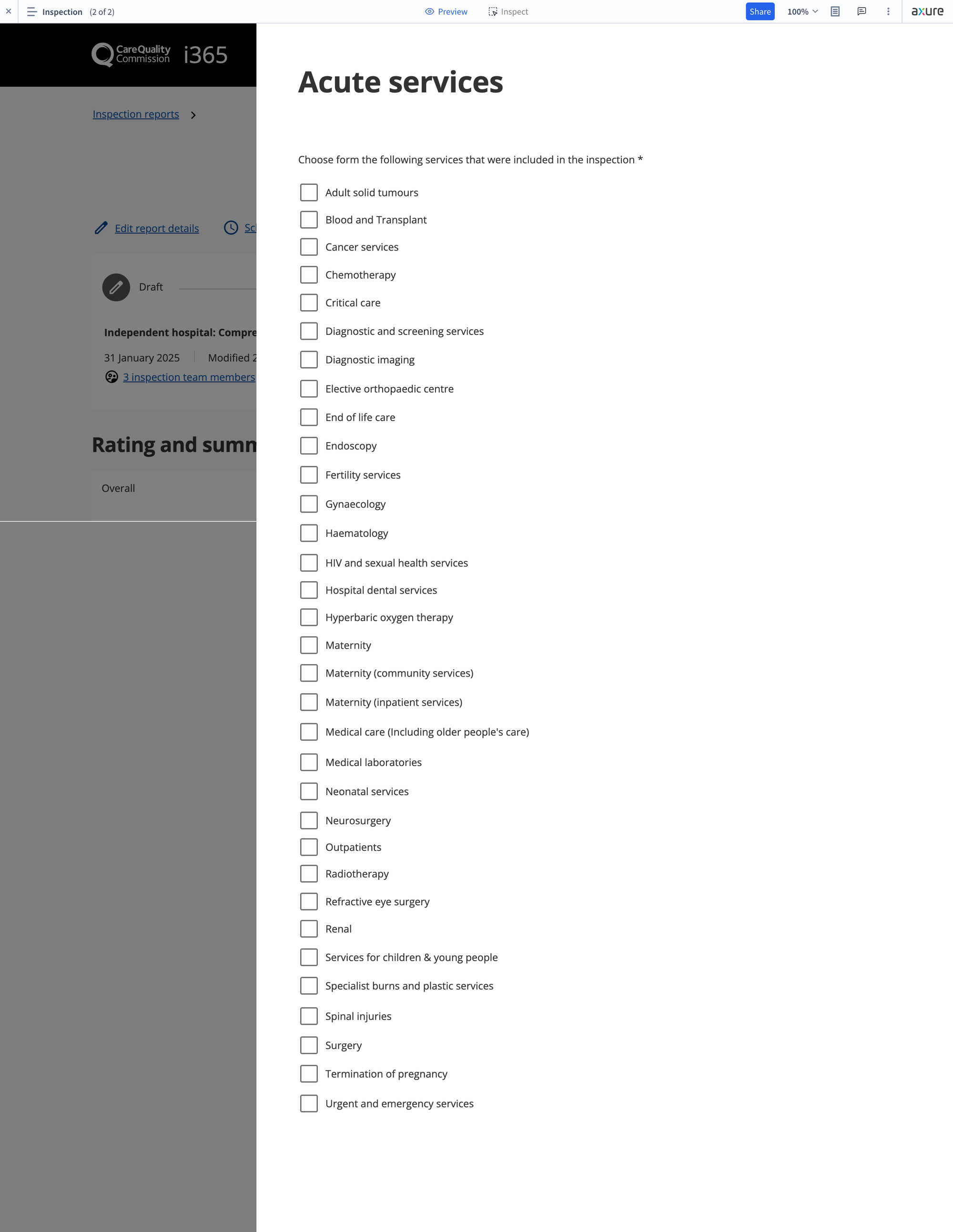
After several rounds of testing, we found that displaying the entire report layout on a single landing page, with input screens sliding in from the right as drawers, solved the problem beautifully. This design not only made it easier for users to know where they were, but also kept the interface sleek and user-friendly.
Here’s a sneak peek at some wireframes showing the new interface improvements.
In addition to the wireframing work, investigations begun on Dynamics integration as well as the final visual design. We'll be sharing more on those topics next week.